Analytics: A view for insights on your check-ins
We've compiled a summary of your check-in responses in a new view intended for quick insights and comparisons over time. Find out how to read it:
General metrics
This is an overview of total responses from a given check-in. The chart on the right is the motivation tracker, the same chart you can check in the Check-ins homepage for insights about your team's mood over time.
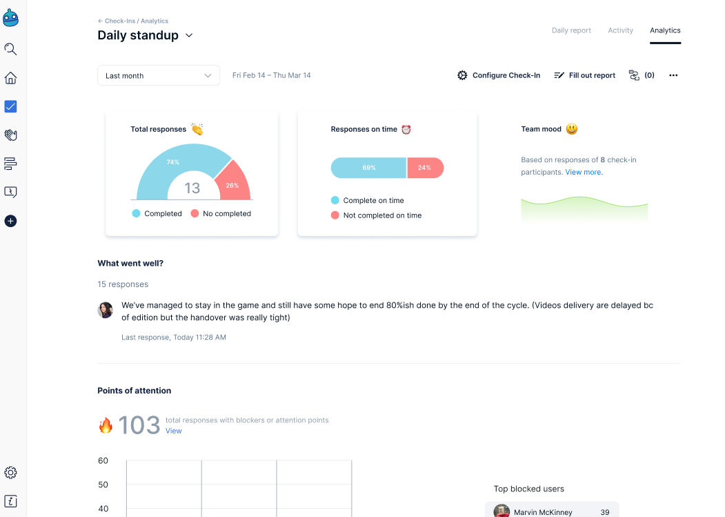
Every check-in has a summary that can be filtered based on 5 time periods:
Today
Last month,
Last 3 months
Last 6 months
Last year
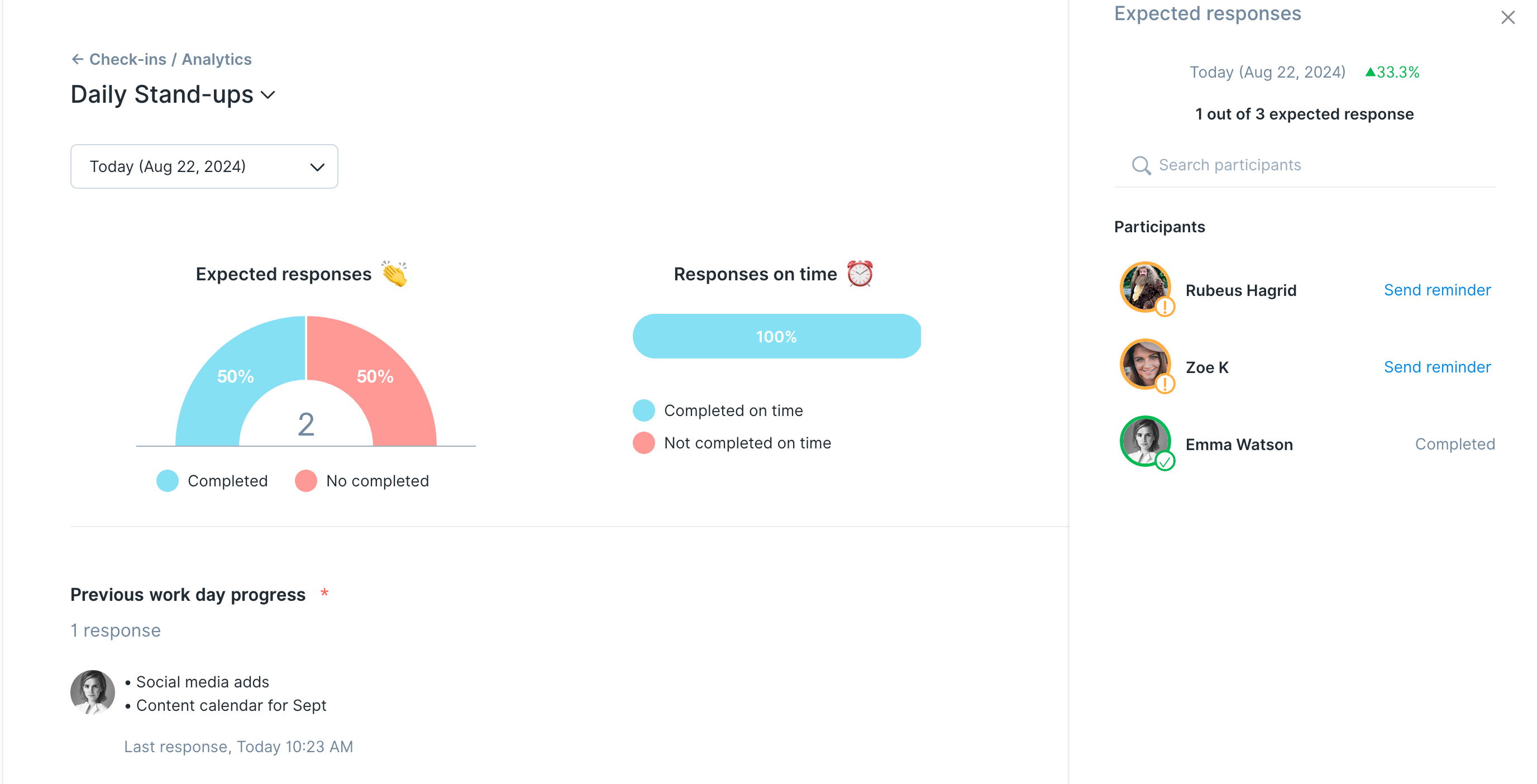
You can click the graph for a closer look into your team's metrics:
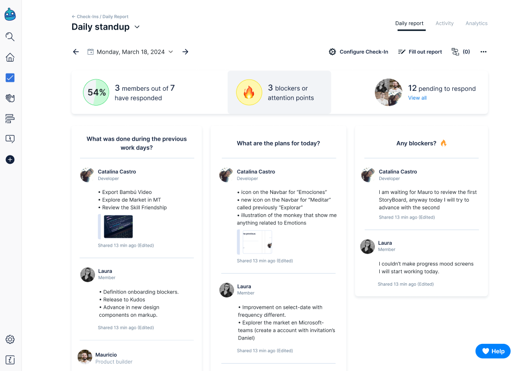
You also have access to your day to day analytics on the daily report of each check-in:
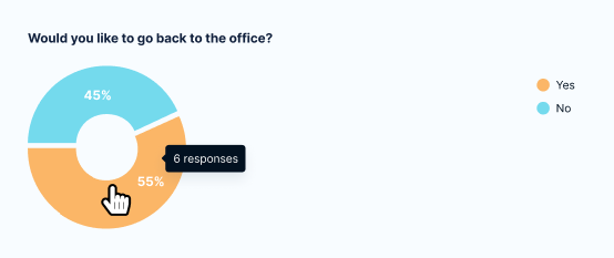
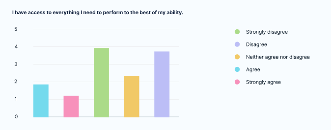
Yes/No questions
Using yes/no questions in your check-ins will result in a pie chart like this under the "Today" view. Hover on each color to see the number of responses for a question.
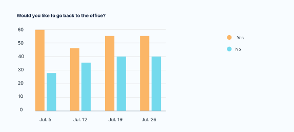
Yes/no questions filtered by a longer time period will result in a bar chart.
This, for instance, is the [last month] view, and lays out the last four weeks in four different sections.
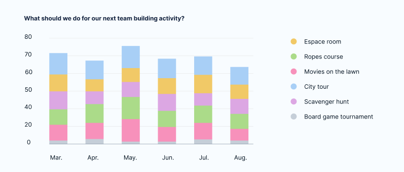
Multiple choice questions
Using multiple choice questions in your check-ins will result in a bar chart like this under the "Today" view.
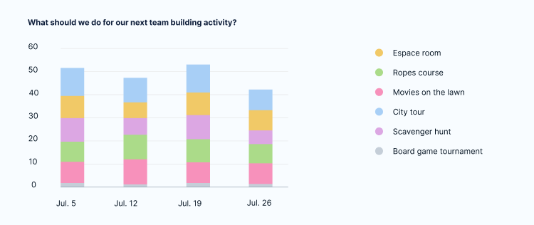
A multiple choice question filtered by a longer time period [last month] will result in a stacked bar chart.
Each stack represents a week:
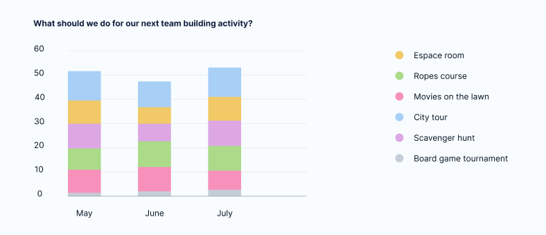
A multiple choice question filtered by a longer time period [last 3 months] will result in a stacked bar chart, though each stack will represent a month:
A multiple choice question filtered by a longer time period [last 6 months] will result in a stacked bar chart similar to the [last 3 months] one, though the number of stacks increases:
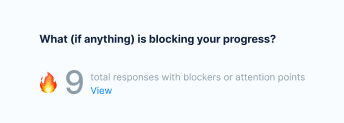
Critical questions
Critical questions (or blocker questions) in your check-ins will show a number like this under the "Today" view.
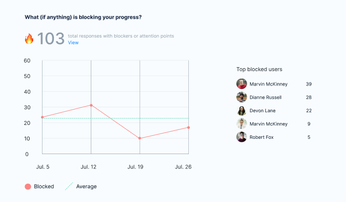
Over time, blocker questions will result in a line chart that sums up the total responses up to that time period.
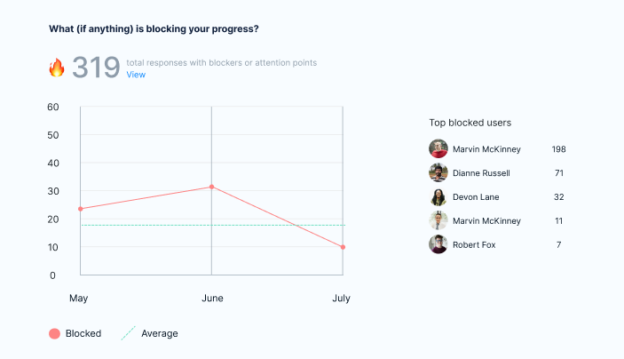
Longer time periods show similar charts, like this one [last 3 months]:
(Someone throw a lifeline to Marvin!)
You can also click on each individual and see the blockers they've reported.